Interfaith America

Desktop High-Fidelity Prototype

Mobile High-Fidelity Prototype

Project Overview

Interfaith America is a non-profit organization that promotes religious inclusion in public life while operating in higher education and civic and corporate spaces. Our goals are to bring desktop and mobile screen design solutions based on executing the user experience and user interface design process. How might we make the website easy to navigate and more actionable so HR decision-makers can find Interfaith workplace diversity, equity, and inclusion training?

The Process

Challenges

First, we evaluated the usability heuristic of the InterFaith America site. We then conducted three usability tests to find how easily users can identify Interfaith America’s services and obtain them. Most users did not like the mega menu because it is lightly shakable when users move to the following menu. Also, they had difficulty completing one task: finding an email and contact person to acquire the service.

Problems: No straightforward navigation and outdated UI

  • The mega menu does not highlight one of the five cards letting the user know where they are.
  • “Sectors” of the primary menu is not clear. Users failed the task because they did not understand the meaning of the “sectors.”
  • The page is very long, and the headlines are enormous. Users must scroll long distances to find information/recall what they have already seen on the page.
  • Outdated design
  • On most pages, use big and bold typography

Original website

  • Mega menu and hero section: no hover state on the mega menu and no proper spacing on the hero section
  • Branding colors are used in a lot of sections, but they are not attractive
  • Text and images are spaced out and too large

Phase 1: Research

During the interview with a stakeholder, we found that they usually connect with corporate partners at conferences or personal connections. They would like to highlight the corporate training on the site. So, we decided to focus our efforts on the users for Corporate Interfaith DEI Training. We want to understand how human resources decision-makers understand a variety of religious traditions and how they seek this information.

User Research Finding

We conducted one-on-one interviews with HR professionals and a survey for our initial user research. 

Empathy Map

User Persona

Phase 2: Definition & Ideation

How Might We Statement

How might we make InterFaith America’s website easy to navigate and more actionable so HR decision-makers can find workplace Interfaith DEI training?

Users Insights

HR leaders overseeing religiously diverse employees want to feel confident, including faith in company-wide DEI efforts because they value an inclusive workplace and want all employees to feel valued and respected.

Feature Prioritization Matrix

We brainstormed ideas to solve users’ problems through the I Like, I Wish, What If ideation process and created a feature prioritization matrix. Users need to find DEI training services and contact information quickly, but the navigation has usability glitches, and the contact information is hidden. The pages are so long, and a lot of content on the pages. We decided to make navigation easy and the pages short so that users do not need to scroll down to find what they need, and add a “Contact Us” CTA in the hero section of the DEI page.

Competitor Analysis

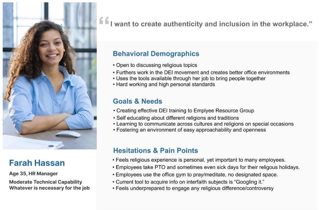
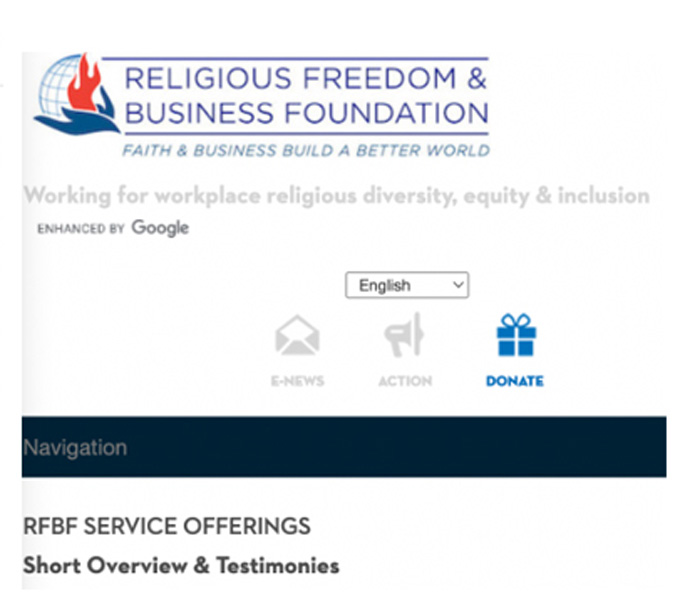
Religious Freedom and Business

Directly religious training for the workplace. Bestowing a “REDI” index rating to corporations as a measurement of companies’ commitments to religious inclusiveness and diversity.

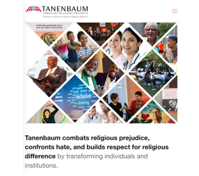
Tanenenbaum Foundation

Religious diversity training for workplace Membership model for corporate and nonprofit Webinars Tools and resources for member access only.

Continu

They are learning Management Platform. They create software for training modules.

Envision Rise

Provide policy and procedure analysis: training and workshops: monitoring, and follow-up assessments.

Major Learnings:

  • Interfaith DEI training is not very common.
  • Some sites had a lot of videos, but the information was confusing and hard to decipher.
  • Many sites did not have direct staff to contact, which made it hard to determine interfaith expertise and establish trust from a web presence.

User Journey Map

Farah wants to hold an employee forum/workshop focusing on religious inclusion in her company but does not feel comfortable creating it entirely on her own. She needs to seek an outside resource for guidance and turns to the internet for help.

Phase 3: Prototyping

Solutions

New navigation and aesthetics update

  • Make navigation attractive and easier on the eyes and address the “Sectors” to the dropdown menu
  • Balance images and font sizes for easier browsing
  • Shorten pages to reduce workload in finding information the user seeks
  • Add “contact us” CTA in the hero section of the DEI page and “Consulting” on the utility navigation menu so that users can find staff to contact easily

New Sitemap

Through the interview with a stakeholder, we found that Interfaith America dedicates religious inclusions to three areas, higher education, civic life, and corporate space. We conducted card-sorting exercises to organize and improve the site’s information architecture because users did not understand the scope of navigation categories and felt navigation was confusing. Also, users did not understand the meaning of “Sectors,” which is not a familiar name for primary navigation, so we removed the “sectors.” We chose to pull out some items and put them into the more significant categories. We put a few secondary items that could categorize into the same topic under each primary navigation.

Sketch and Wireframe

Low-fidelity Usability Test

After we made the wireframe, we performed two in-person tests with two tasks to see how informative and accessible the site was for our users. The key findings of the user tests were that we need to change the page layout to provide a clear path for the navigation and highlight the “Contact” button or place contact CTA in the hero section. Also, we decided to create two essential screens, landing and Interfaith Religion at work screen, concerning our user flow.

High-fidelity Prototype Navigation

Phase 4: Test

High-fidelity Prototype Usability Test Analysis

After improving the navigation and visual design as a result of our low-fidelity usability testing, we performed five final high-fidelity usability tests targeted towards locating DEI resources in the workplace and identifying the contact information of consulting staff. Based on the test result, we renamed “Religion in the Workplace” to “Diversity, Equity & Inclusion” for users to quickly find DEI training service information.

Final Thought

We observed users were able to accomplish their task better through new navigation.

  • More functional/easy to navigate – the “sector” tab was removed, and the new mega menu allows users to find what they need quickly.
  • The redesigned webpage has a good scroll length. This kept the user glued to the webpage for longer when scrolling.
  • The logo, animation, graphics, typography, and color are more consistent with a stronger brand identity.
  • Since we added “Diversity, Equity, and Inclusion” to the navigation, users can easily find the DEI training service and contact information.