U.S. Department of Education

Desktop High-Fidelity Prototype

Project Overview

THE PROBLEM:

The website is riddled with broken links, an overwhelming amount of text, and insufficient logic for the users. The main navigation doesn’t have the second items, and a lot of important links (navigation) place below the fold. So users need to scroll down the long page to find the information, and it make users confused about where they are on the page.

THE SOLUTION:

The primary navigation needs to be redesigned and restructured to help users find information functionality quickly. For example, we could consider the mega menu to collapse many links and shorten the long page.

Research & Analysis

Proto Persona 1

Proto Persona 2

Usability Heuristic Annotations & Color Accessibility

Usability Testing Plan

Usability Testing Task

Task 1: Locate a grant you can apply for to help pay for school.

You can find a grant or scholarship to apply for.
This is a user looking for financial aid information and how they will pay for college.

Scenario: 

Imagine you are a current college student looking for ways to pay for college. Locate one financial aid option to pay for your schooling.


  1. Home page
  2. Grants
  3. Various options on the page

User locates a grant they may or may not qualify for.

Many broken links, many links take user outside of Ed.gov

Task 2: Locate an opportunity to have your student loans forgiven.

Find a way to reduce or eliminate a student loan.

A user already has a school loan, and looking for partial or complete forgiveness of the loan.

Scenario: Imagine you are a college graduate who has a mountain of student debt. You are going to the US Department of Education website to see if you can get some or all of your student debt forgiven.


  1. Home
  2. Student Loan
  3. Public Service Loan Forgiveness (PSLF)(outside of Ed.gov – FAFSA)

Arrive at FAFSA page at  Public Service Loan Forgiveness (PSLF)

Task 3: Identify and Describe Pages

User explains what page they are looking at, how they can tell, expectations for how to figure it out, and how they would normally figure out where they are at on a web page.

User skips the homepage and visits the Grant page and student loan page.

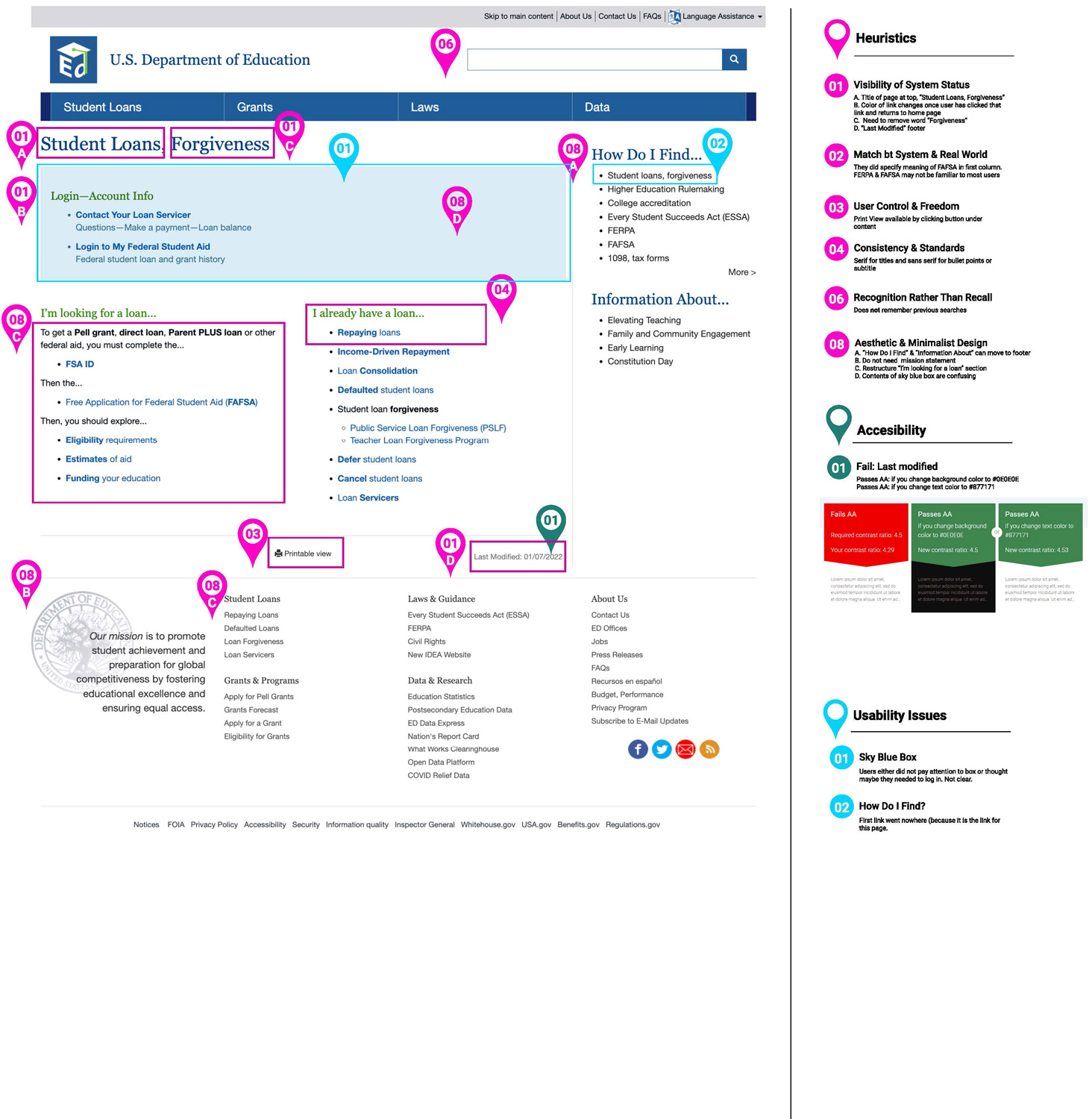
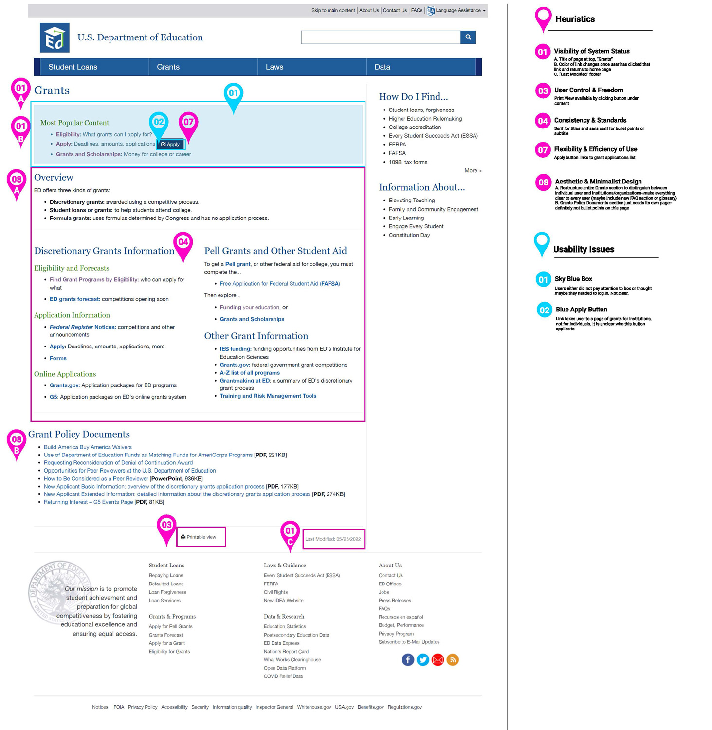
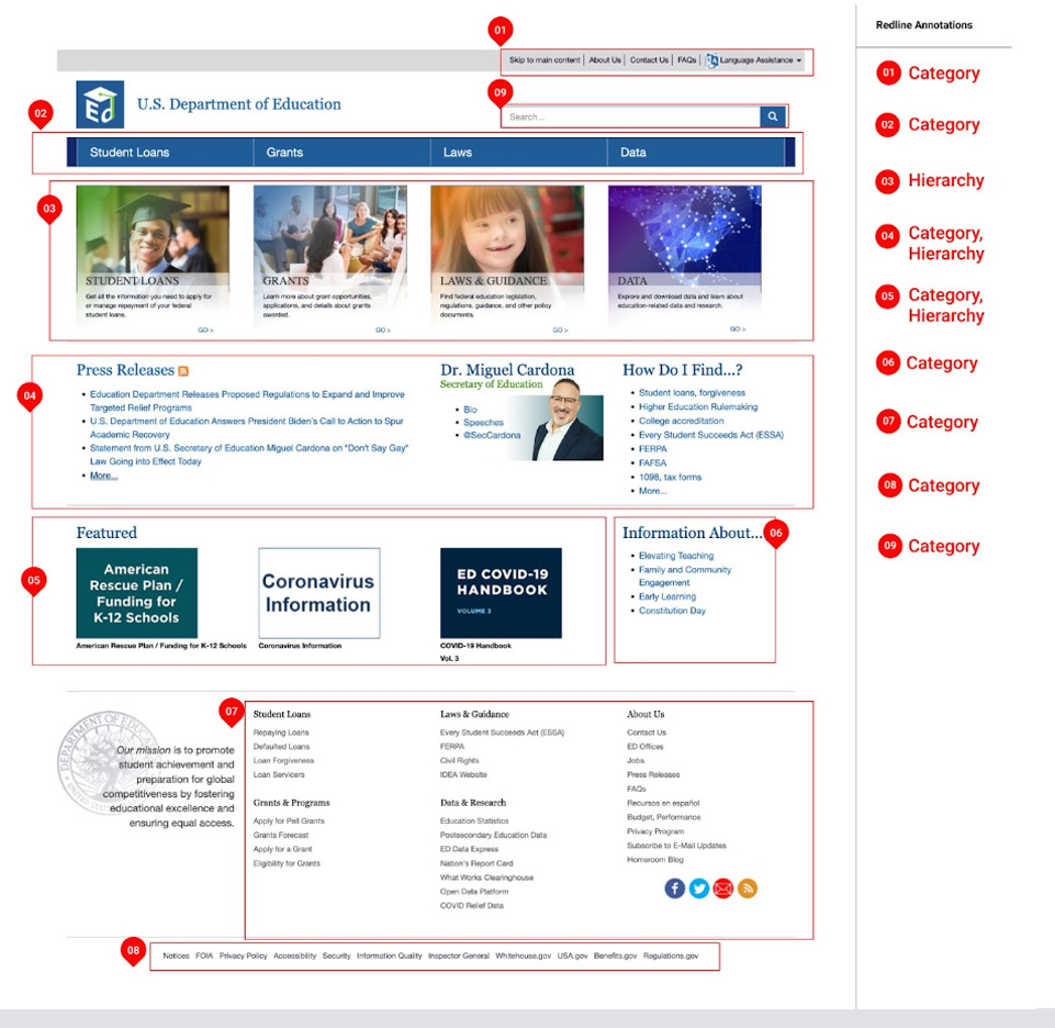
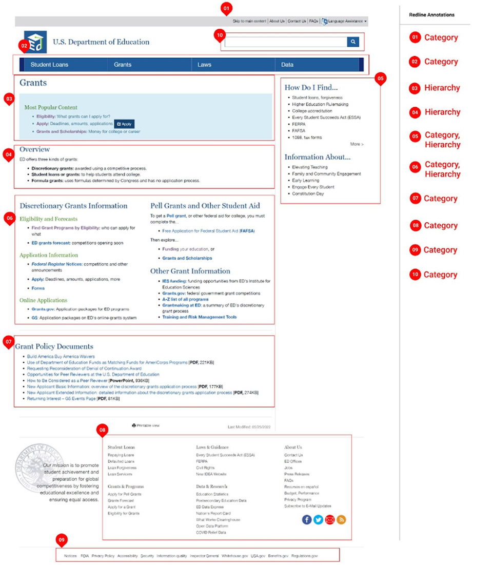
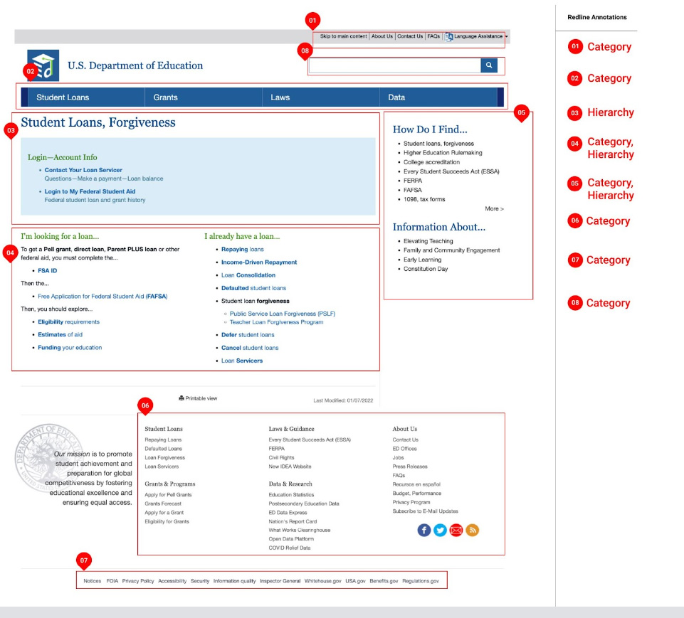
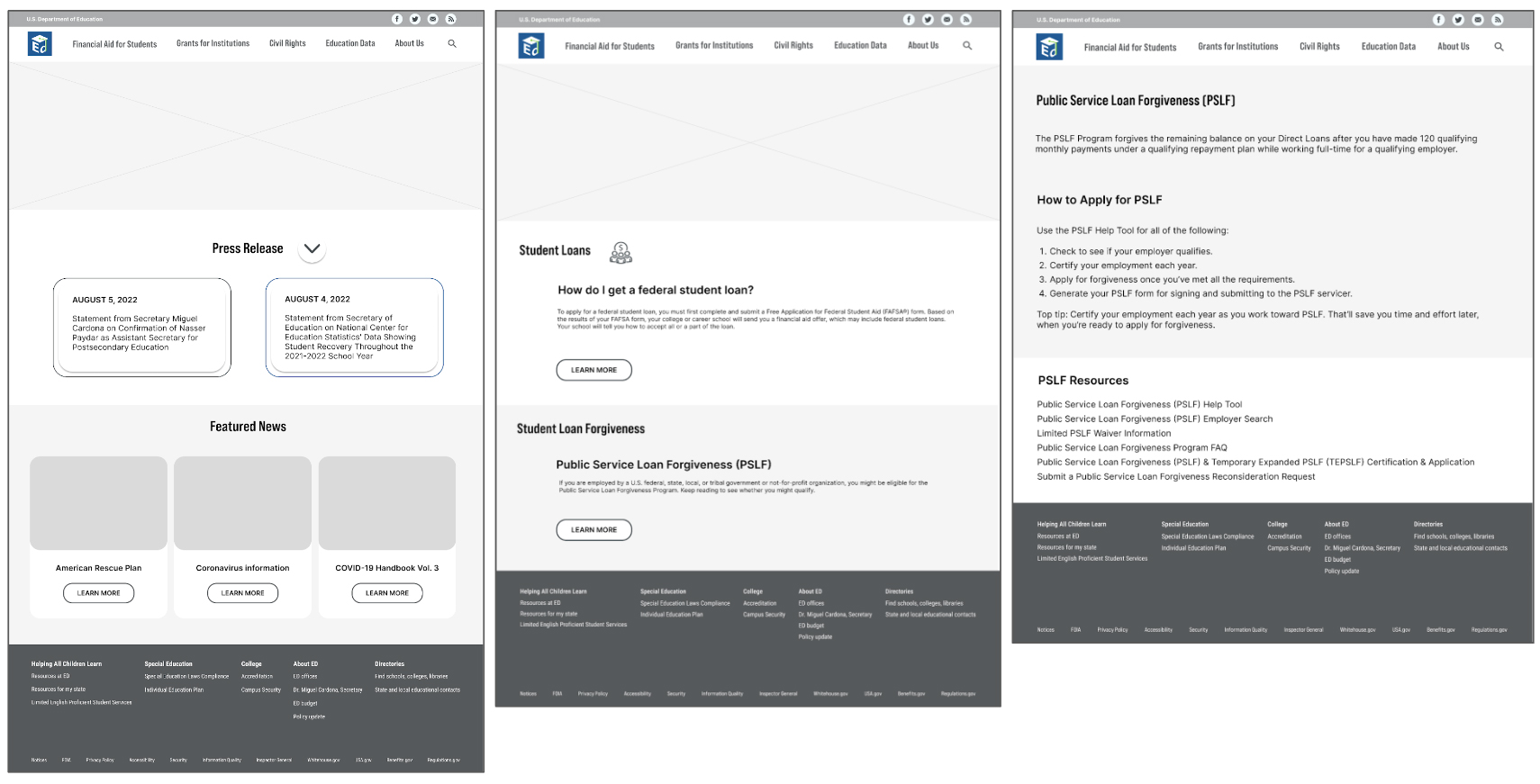
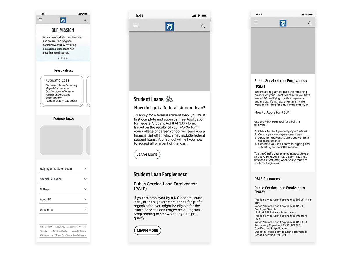
Tester shows user this link: Page 1 and Page 2.

Tester says, Pretend you just arrived at this web page. Where are you on the website?”

User responds.

Tester says, How can you tell?

User responds.

Tester says, “What would you expect to see here to help you know where you are?

User responds.

Tester says, “What would you normally do in order to find out?

User Responds.

Usability Testing Analysis

  • Give structure to the organization
  • Make sure levels of importance are clear
  • Keep fat footer
  • Fix known broken links
  • Keep the search bar at the top
  • Keep the logo as a home link
  • Place the mission statement above the fold
  • Create a nesting/drop down menu
  • Align URL with content
  • Update overall look

Moodboard

UI Navigation Analysis

Annotated Agency Navigation

Usability Website Navigation Testing Notes

Key Takeaways:

  • Too many clickable links (navigation) on one page; forces users to read all of them in search of the information. It makes them frustrated, as it takes their time.  
  • There is no secondary item in the main navigation, so users need to go to each page for their needs.
  • Primary navigation design is not optimized for the mobile device. 
  • A lot of links are broken, and the same links are repeated. 
  • Users have a problem with abbreviations, so we need to spell or add descriptions near the education jargon. 
  • Footer is easily accessible, but it could be redesigned to find it more easily.  

Card Sorting Results

Ed.gov Revised Site Map

Phase 3: Prototyping

Wireframe

5-second Usability Test

Things to keep

  • Clean design
  • Icons on the main banner
  • Font size
  • Typography

Things to change

  • Place more important content first. Switch the order of “Press Release” and “Featured News”
  • Not sure about the purpose of website
  • Kids’ pictures are too dominant
  • 3 other hero images do not deliver any meaning
  • About Us needs more description
  • Color accessibility test

UI Style Tile

High-fidelity Prototype Navigation

Phase 4: Test

Usability Testing Plan for Mobile

Locate an opportunity to have your student loans forgiven.

The objective of this testing is to find problems and errors in 1 task flow that need correcting on mobile prototype.

Can users locate an opportunity to get their student loans forgiven.

Find the way to reduce or eliminate a student loan

A user already has a school loan, and looking for partial or complete forgiveness of the loan.

Scenario: Imagine you are a college graduate who has a mountain of student debt. You are going to the US Department of Education mobile screen to see if you can get some or all of your student debt forgiven.

  1. Home
  2. Financial Aid for Students
  3. Student Loans
  4. Public Service Loan Forgiveness (PSLF)

Arrive at Public Service Loan Forgiveness (PSLF) page

Usability Testing Plan

Iterate high-fidelity mobile prototype

Final Thought

How to Find Real Users?

Without having an interview with real users of Ed.GOV, it was not easy to design in user mind. During my usability tests with my colleague, friends and classmates, they tend to ask why the “Press Release” is on the homepage. 

Here are the reasons;

First, the “Press Release” is displayed on the homepage of real Ed. Gov website.

Second, I think it captures the most recent information.

However, the testers and myself are not real users, so I designed the site with based on a lot of assumptions. I’m wondering that how to find real users of public website and test with them to understand how they really perceive and use the website. 

Easy navigation and clean / modern minimalist design

During the user test of the original Ed.Gov site, users lost their path and got frustrated. I focused on designing easy navigation helping users find what they need within 3 clicks. I spelled out legal term and added icons on the primary navigation. Also, I tried to reduce any irrelevant design elements to contents to have a clean and simple design.