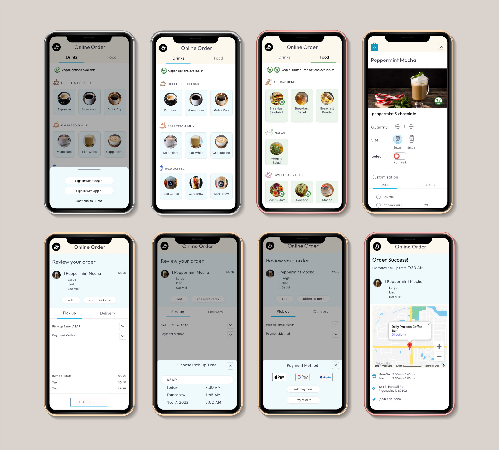
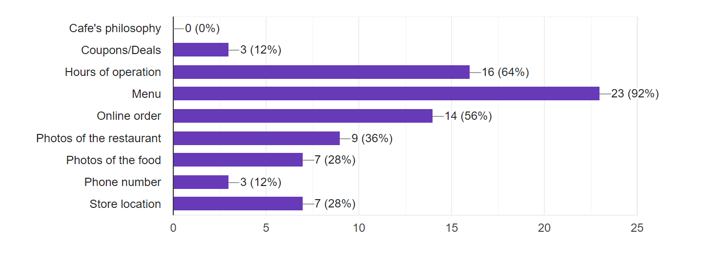
Tailored towards rewards program
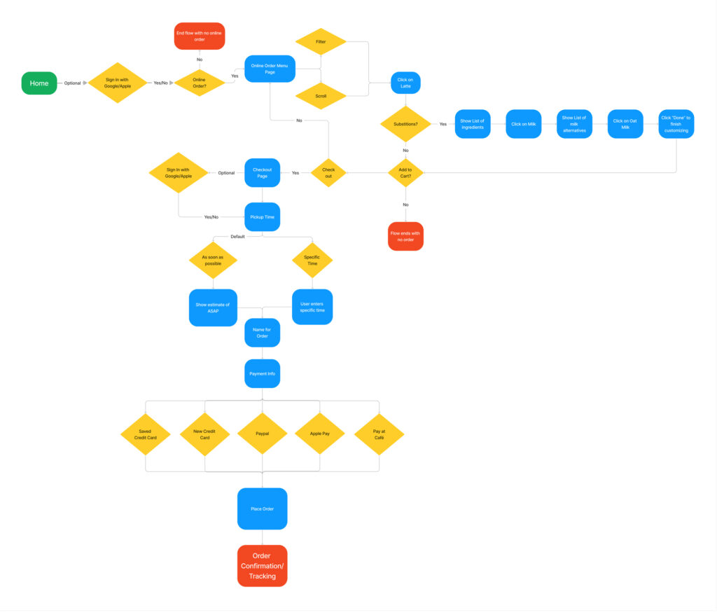
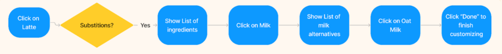
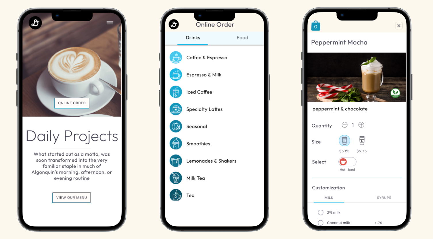
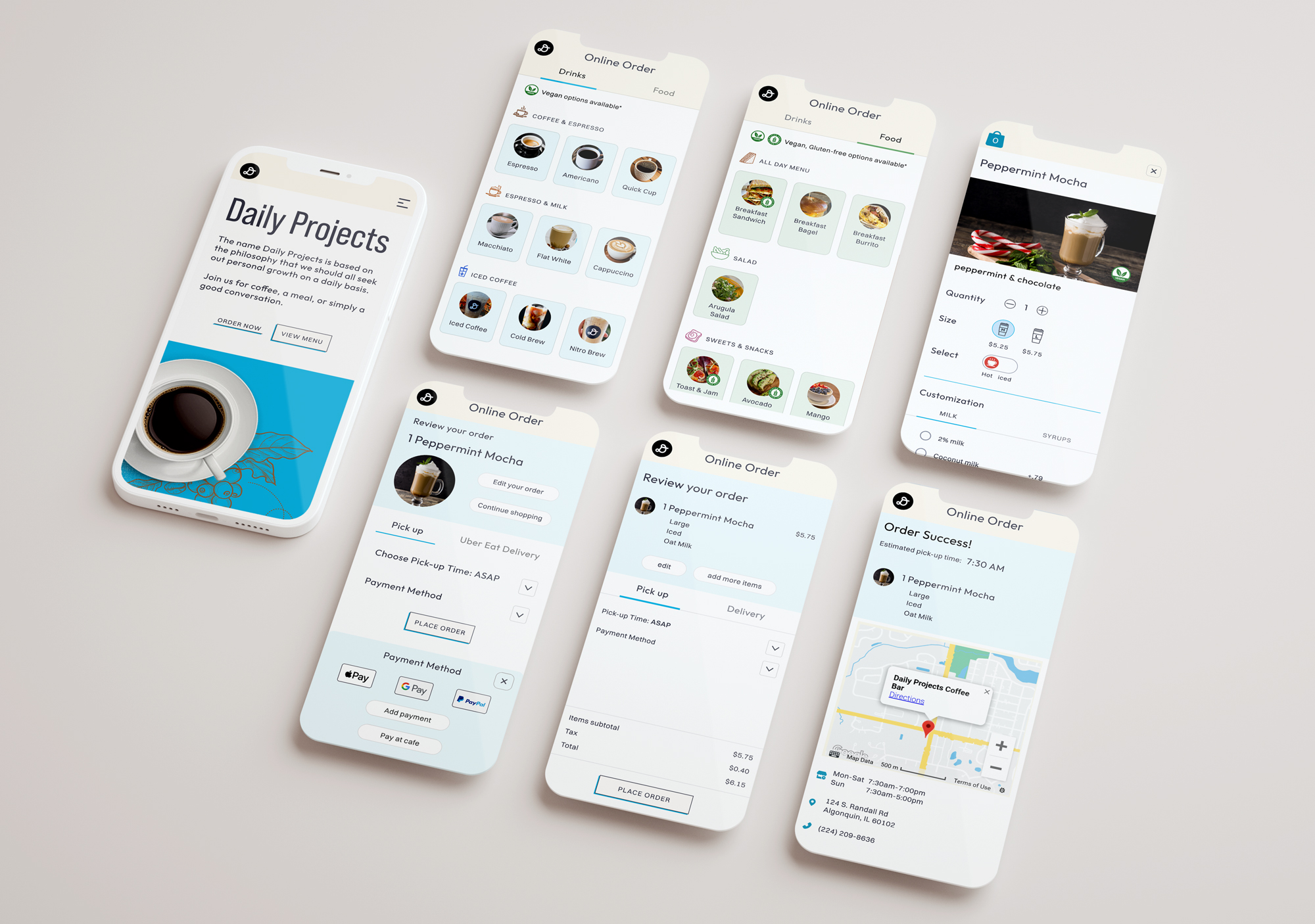
Ordering ahead model
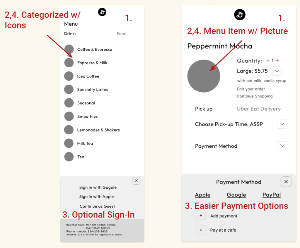
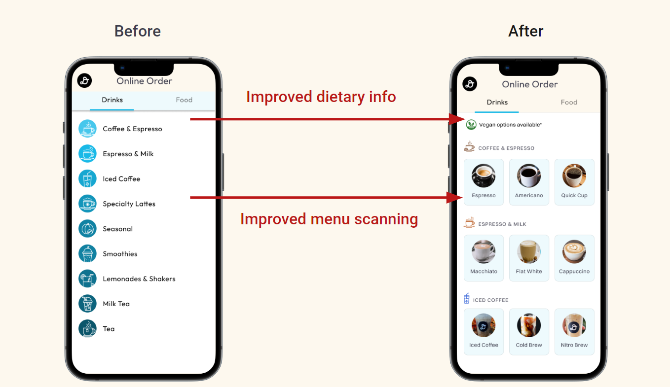
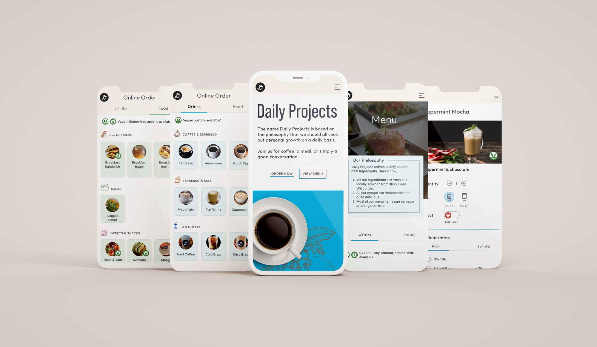
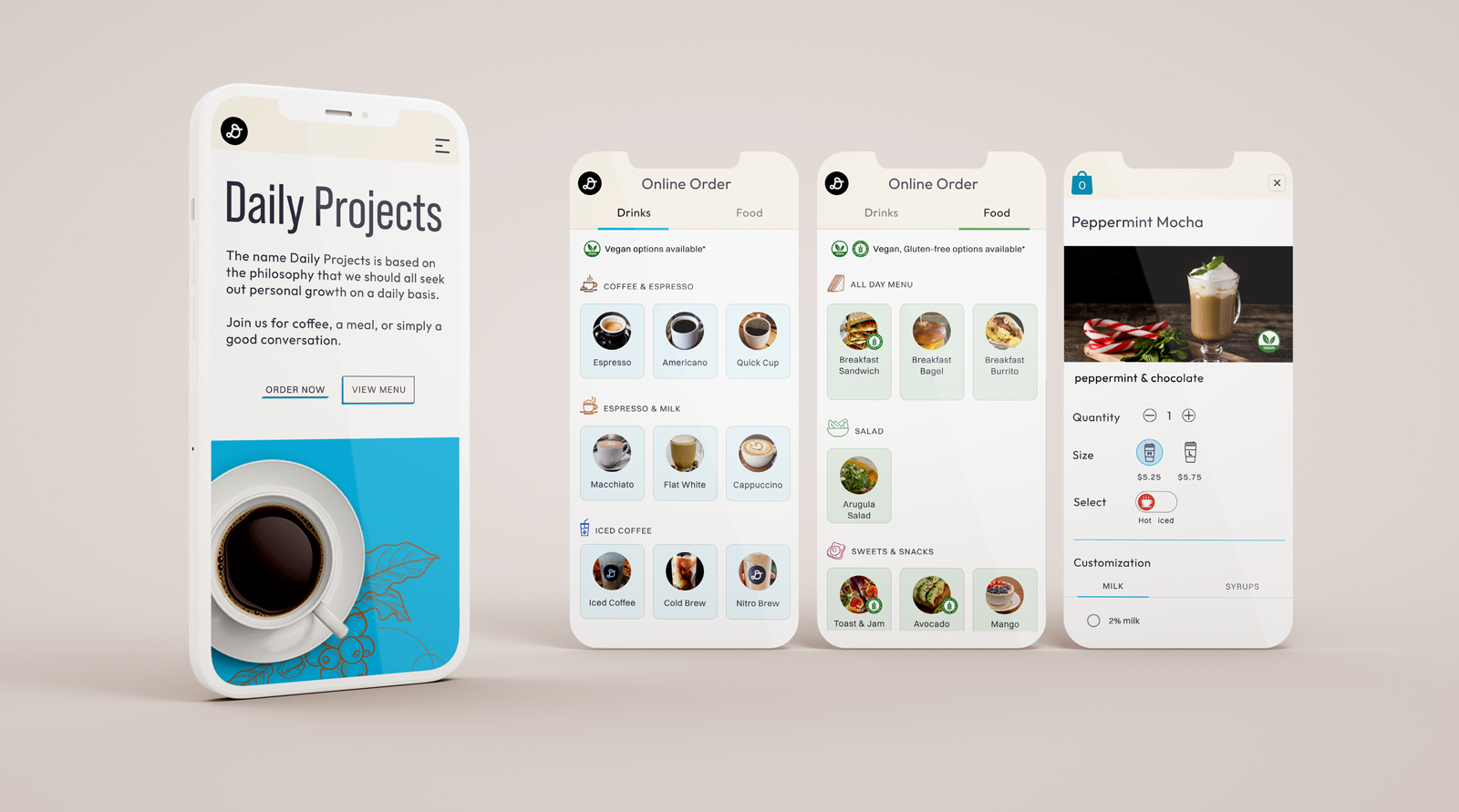
Menu layout with different sections
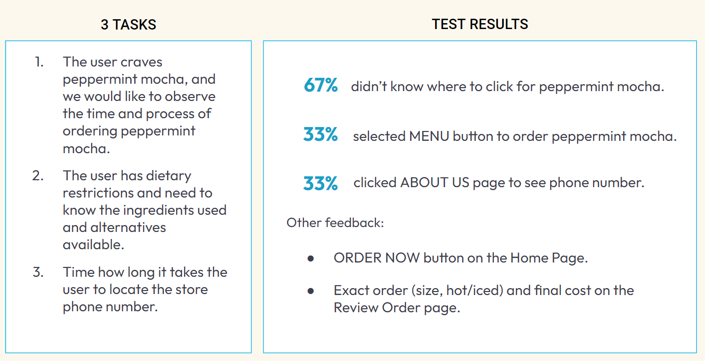
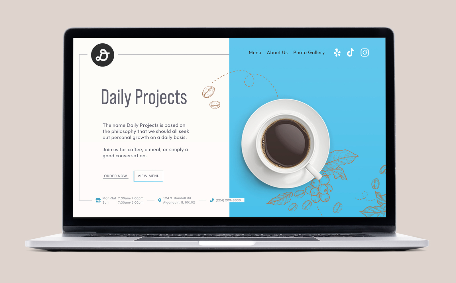
Sawada explain where their coffee is from
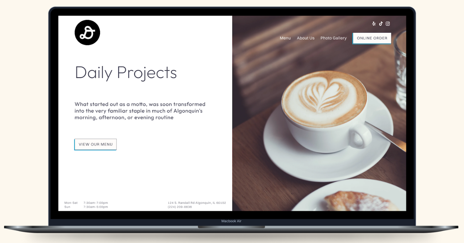
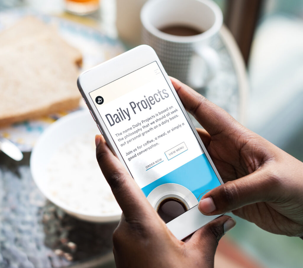
Compelling Photography
Uses Doordash for online orders
Comprehensive landing page with valuable information
Simple Navigation
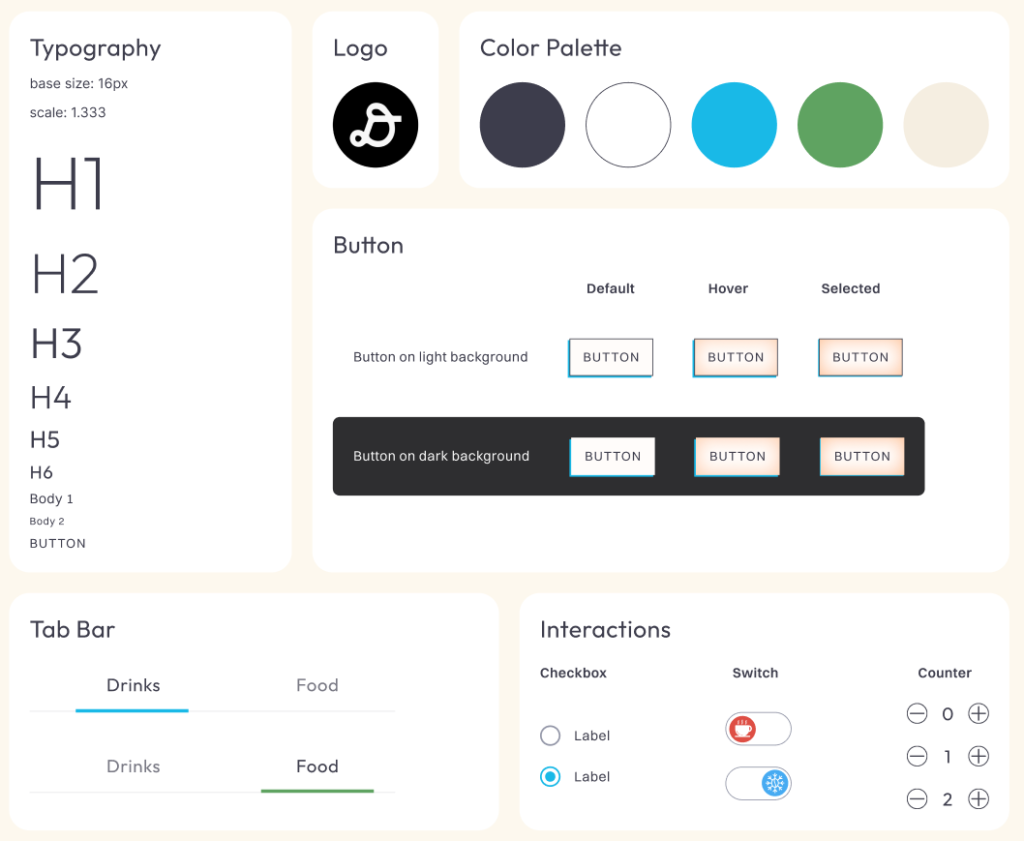
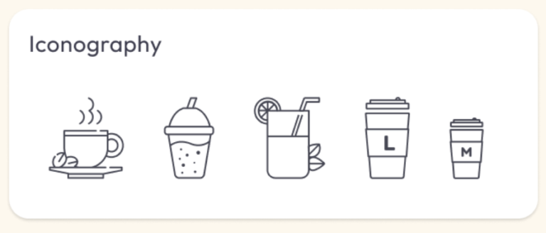
Design Consistency