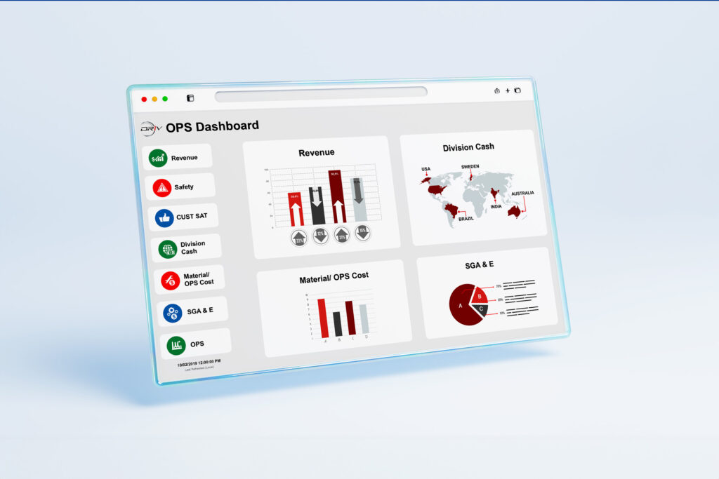
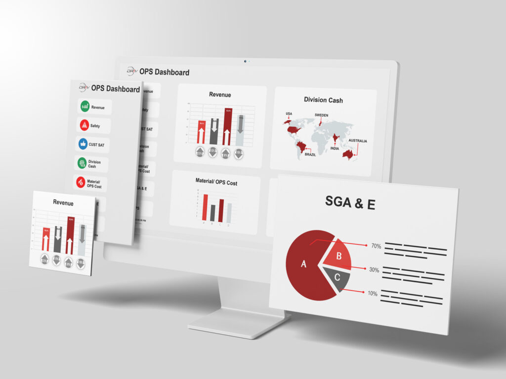
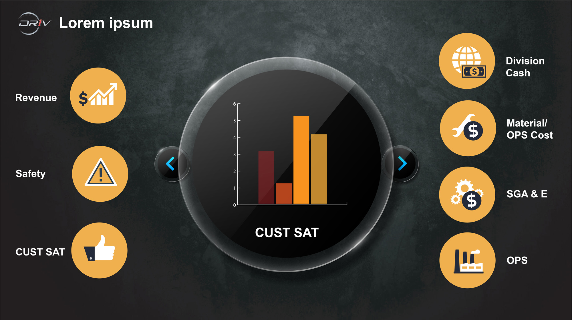
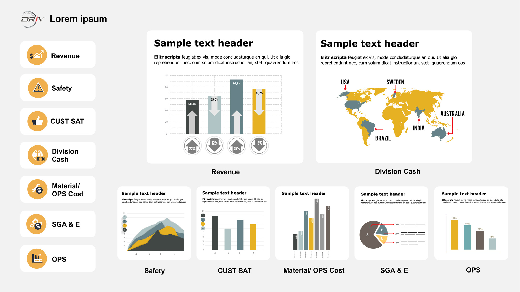
CEO requested a one-page operating dashboard so that he and executive leaders could look at and drill into it from the enterprise to business line level, used as part of the OPS review. I collaborated with strategists for UX research to integrate enterprise-wide data in one place so that users could take advantage of performance enhancements. I designed the overall look with the color scheme and icons to provide context to data and make KPIs fast and easy to understand for users. I set up dynamic textboxes or images, for example, if a KPI is underperforming from its target, so users never miss anything important. These features enable users to visualize data quickly and thoroughly explore the insights by interacting with a single screen.