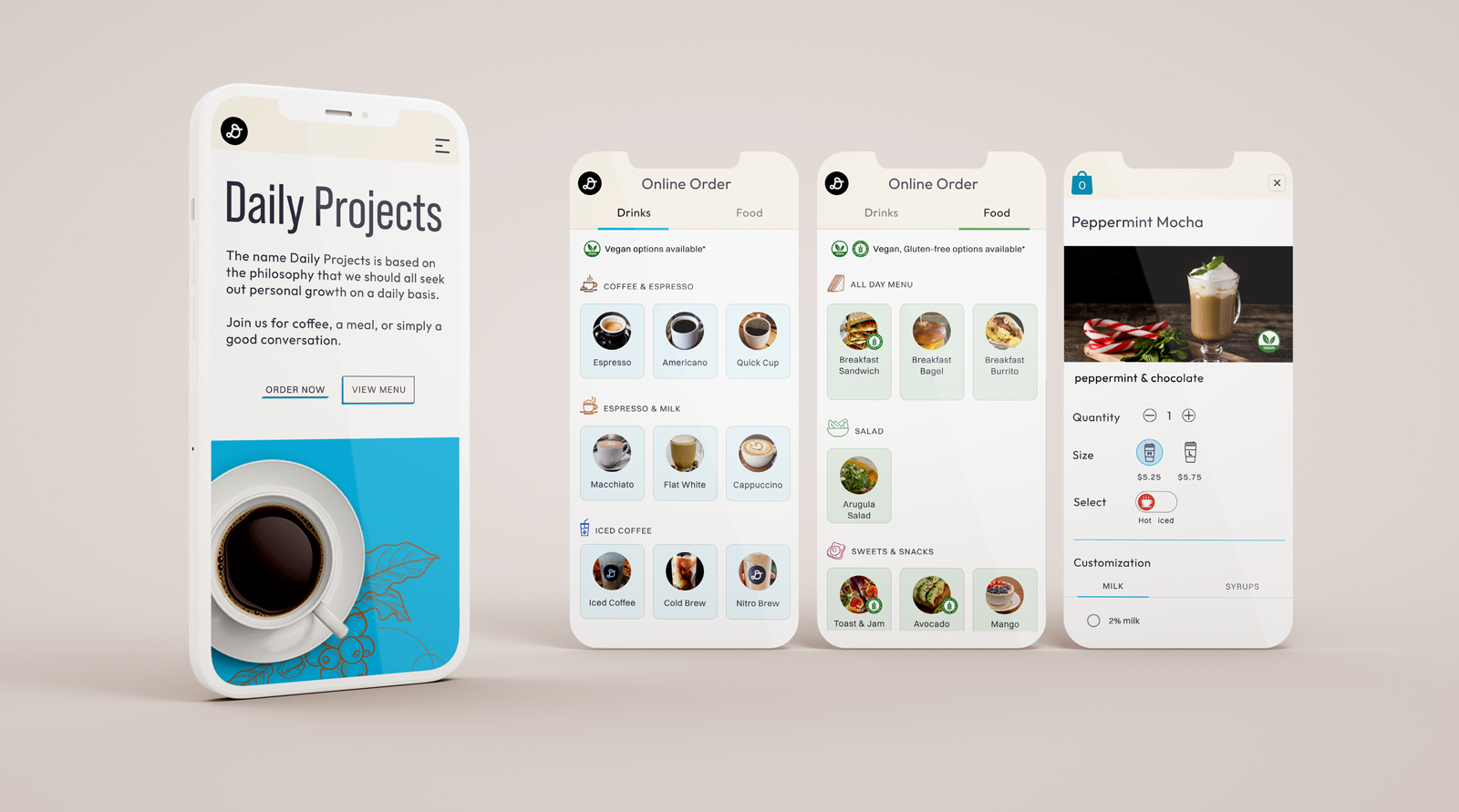
Daily Projects Coffee Bar
Project Overview
Daily Projects is a local coffee shop for sandwiches, coffee, or other beverage in Algonquin, IL. The current website’s design is outdated, unorganized and users cannot easily find online order features. How might we redesign the site so users place orders in advance, pay for them through the site, and then pick them up at any convenient time?
Phase 1: Research
We wanted to understand the website’s business goal, customer demographics, what type of users daily projects have, and what motivates people to visit the café website. Considering these goals, we conducted stakeholder interviews, two surveys, and competitor analysis.
Stakeholder Interview
We sat down with Heidi, the owner of daily projects, and understood her frustrations with the current website. Our key findings were broken up into different sections Business Goals Driving online orders, Customer Demographics understanding what type of users daily projects have, and Heidi’s personal needs, which were a compelling design and online order functionality.
Key findings
Appealing fonts and colors, information
Online Survey
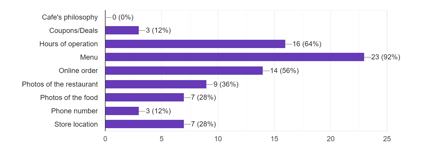
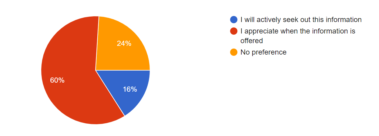
We created two surveys, one for general café users and the other for Daily Project customers; we were able to connect to daily project customers via their Instagram.
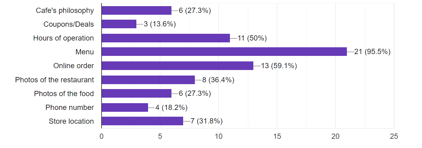
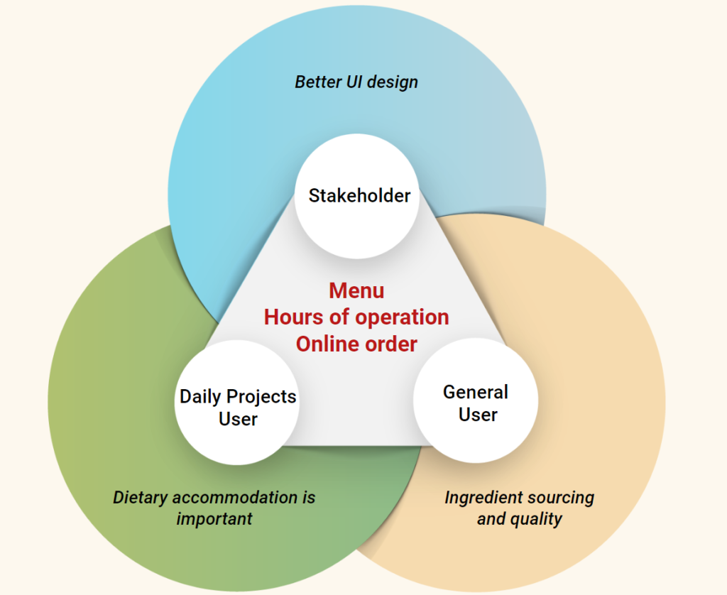
Some key insights were that both users are concerned about the menu, online orders, and hours of operations; however daily project customers are more interested in dietary accommodations and the cafe’s philosophy.
Survey Insight
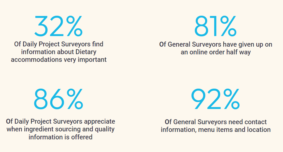
Have you ever given up on an online order halfway through checkout? If yes, why?
Competitor Analysis
- Competitor analysis inspired us to design a website with design consistency, and a user-friendly flow.
- We analysed several different direct and indirect competitors.
- Some key finding from direct café competitors was seeing how responsive some sites were by having design consistency across all pages.
- What we learned from our Indirect competitor like Einstein bros bagels was how they utilized imagery in their menu and really pushed towards online ordering.
Phase 2: Definition & Ideation
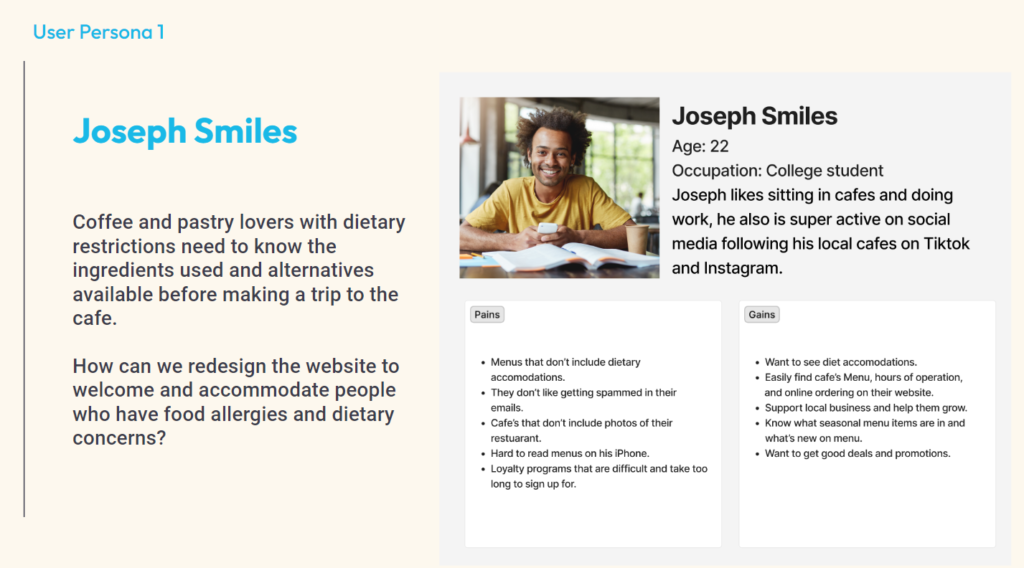
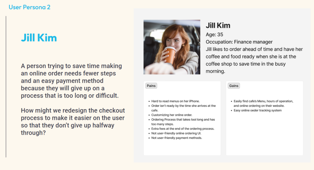
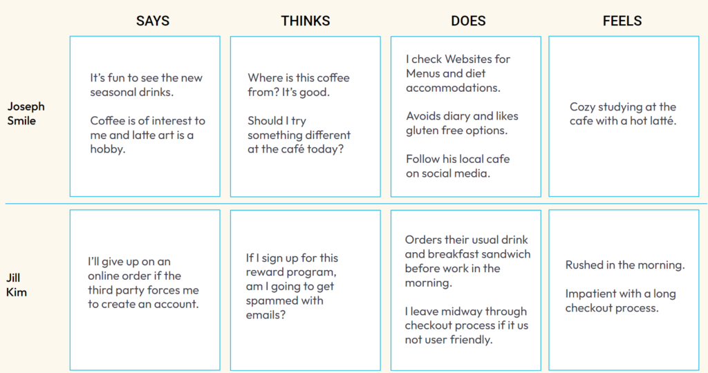
After we conducted an interview and surveys, we could better understand the café customer demographic such as age, occupation, and eating habits, so we decided to have two distinct user personas. Each user had different pains, gains, and journey to meet their goals.
User Persona 1
User Persona 2
The second user persona is Jill Kim, a finance manager and she is rushed in the morning, so she prefers to order her coffee and food online with her phone to cut out the wait time. An easy and fast online order process will allow her to call on the go and save time. How might we redesign the checkout process to make it easier on the user so that they don’t give up halfway through?
Brainstorming
And then we did the I like, I wish, and what if methods and prioritized these ideas. These gave us an idea of what we could do to solve users’ problems. We decided to focus on “Do now” first and “Do Next” After that, we went back to our research data, the stakeholder interview, and two surveys to continue thinking along with our research data to solve users’ problems. The Menu, Hours of operation, and online orders are what the stakeholder, general users, and daily projects users want for a café’s website. Additionally, stakeholder needs better UI design, dietary accommodation is essential to daily project users, and general users like to see ingredient sourcing and quality.
Key Components:
- Responsive mobile menu
- Including ingredient sourcing and quality
- Including Vegan, Gluten-free options available
- Easy to find
- Fast and convenient
- Customizing options
- Multiple payment options
- Easy UI interface
- Login with Google/Apple account
Phase 3: Prototyping
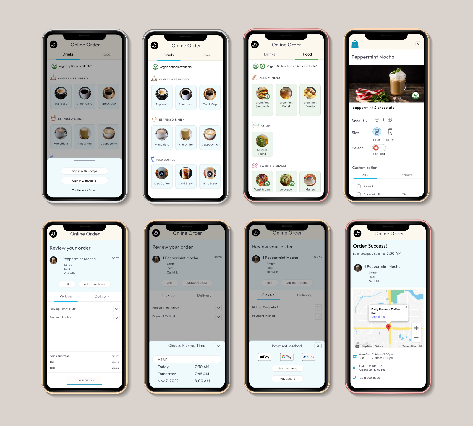
Key Components: Online Order
Streamline online order
- Make Sign-In optional
- Allow for substitutions
- Add the easiest payment methods
Full User Flow
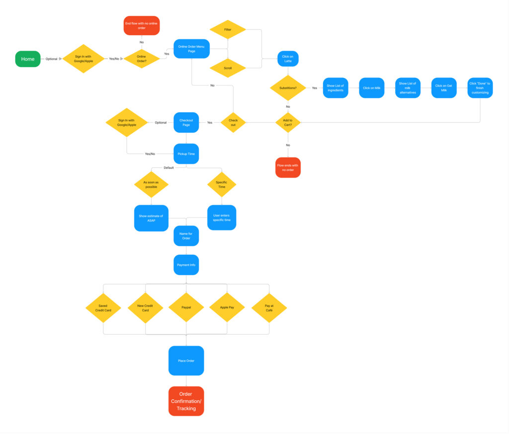
Substitutions

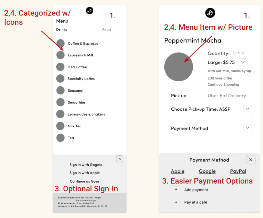
Mid-Fidelity Mockup
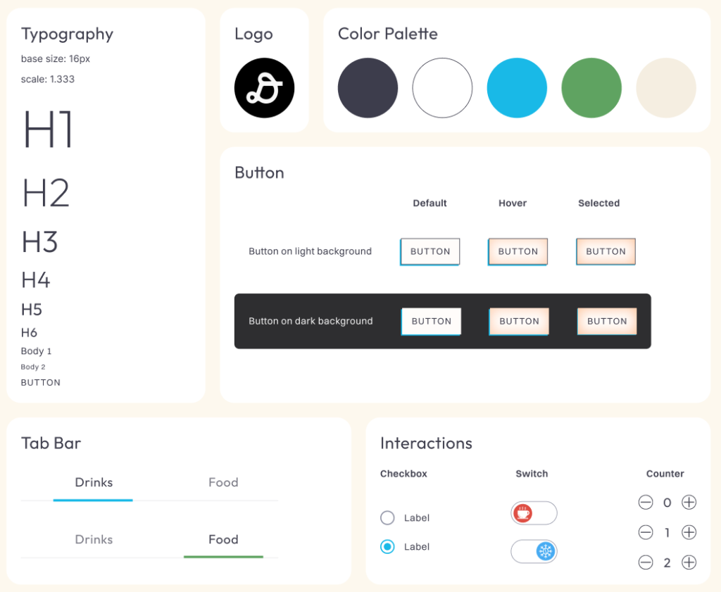
Style Tile
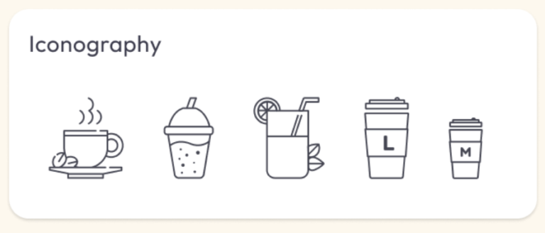
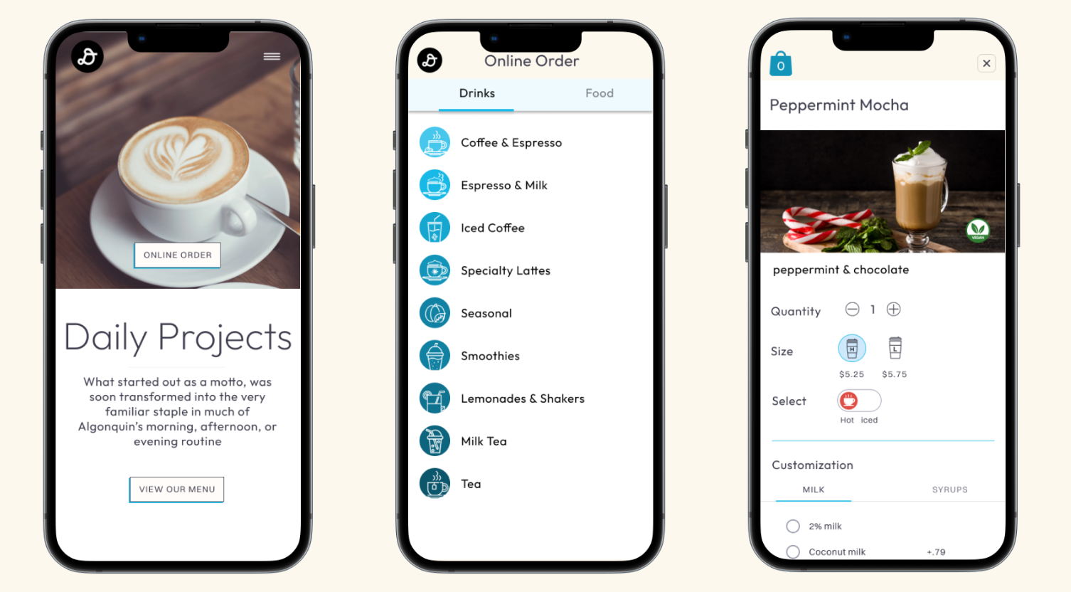
High-fidelity Prototype Navigation
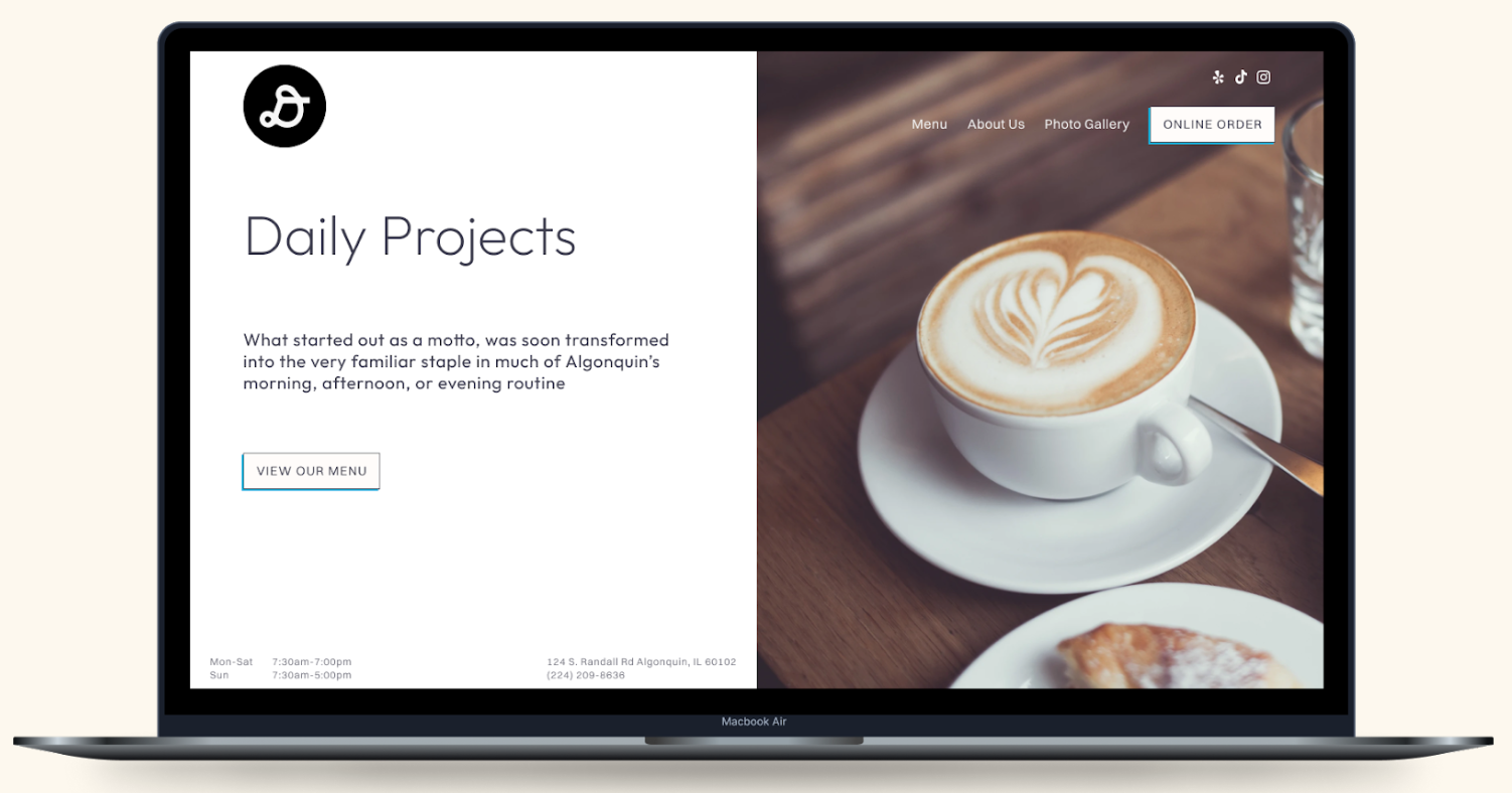
Phase 4: Testing & Iterating
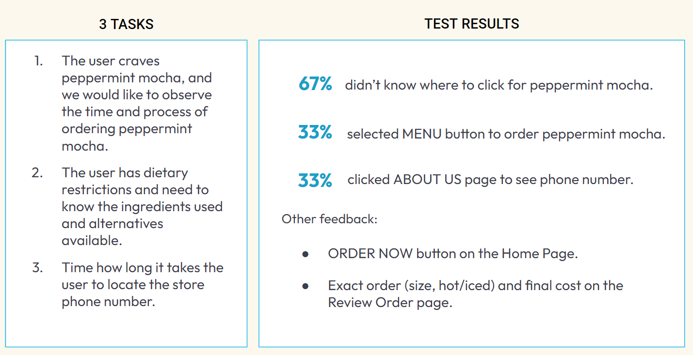
High-fidelity Prototype Usability Test Analysis
Here is a summary of our finding that we asked users to perform.
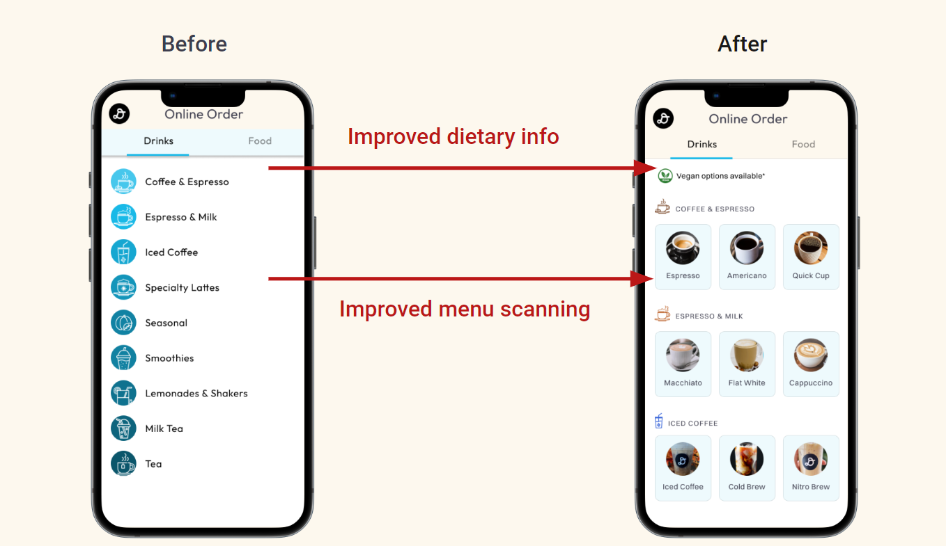
Usability Test Iterations
Because we went through the testing process, it improved our product by understanding that users need imagery in the menu to know where to look for specific items, ultimately leading to fewer clicks. We prioritized this problem first because it was our most prominent issue.
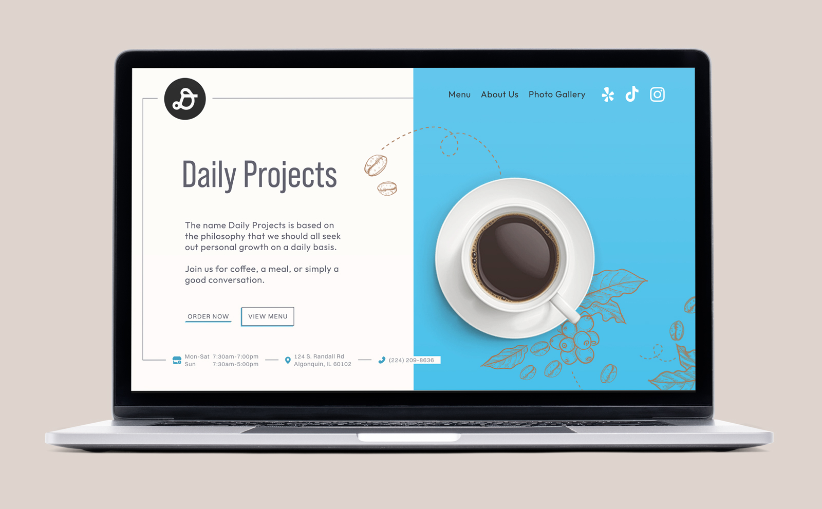
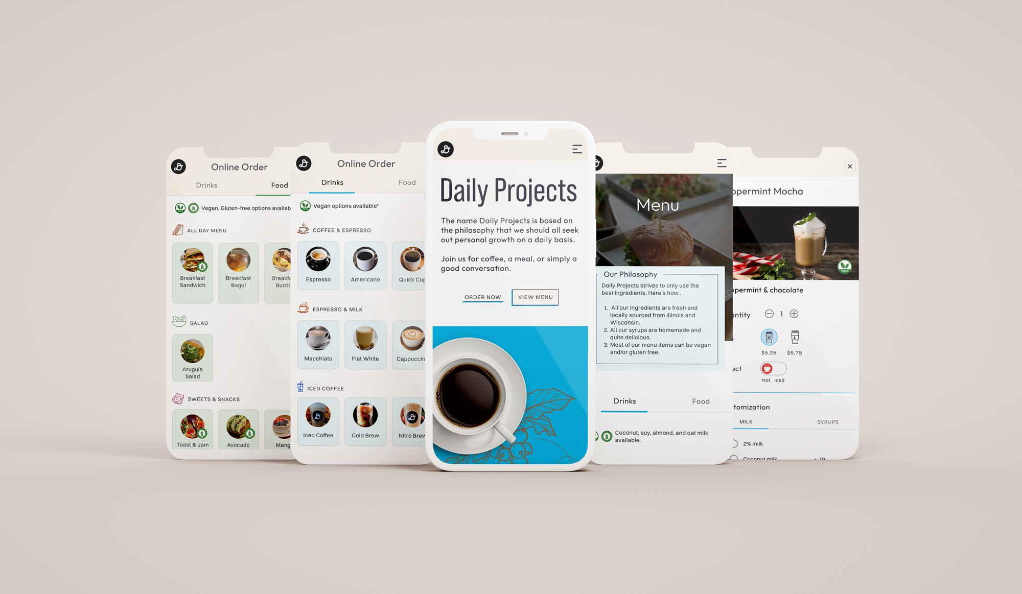
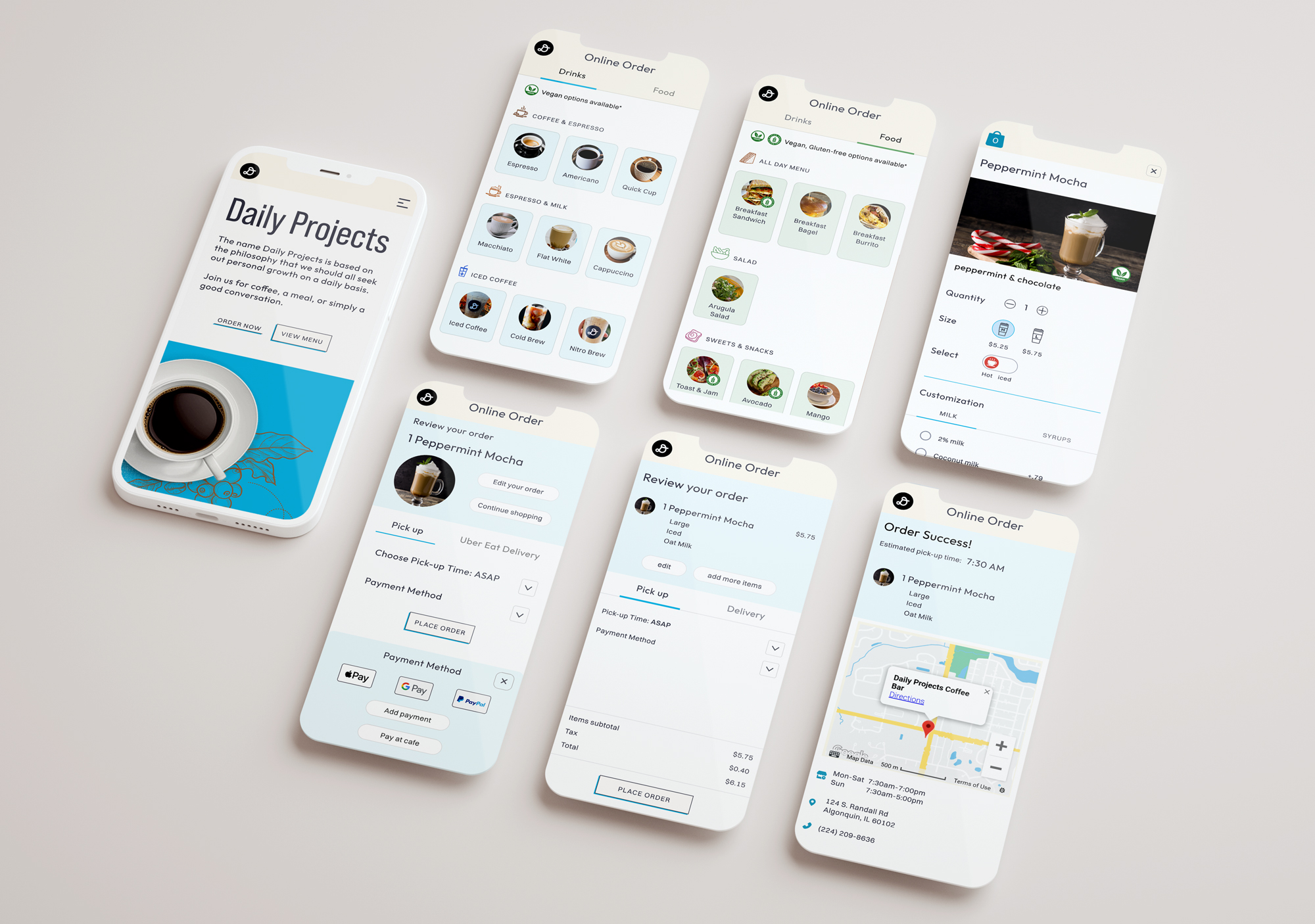
Final High-Fidelity
Similar to our first original high fidelity, this is our final version, where we went back and focused on feedback from our testing.
Final Thought
The three key components of creativity adopted to the Daily Projects’ site so that users’ most paint points are solved, but we need to continue to develop more features such as a royalty program, membership, FAQ section, and customer review sections. Also, the stakeholder is considering changing the current POS to a different one to provide customers with a better order and payment system. Our user research for Daily Projects customers will help how the stakeholder review POS software and affect users’ experience.
